Principles of Design
Contrast
In design, contrast is the difference between two styles or themes. While constrast can be color (for example, black and white) it can also be represented in styles, such as font or the curvature of a line. Contrast helps to draw attention by creating difference.
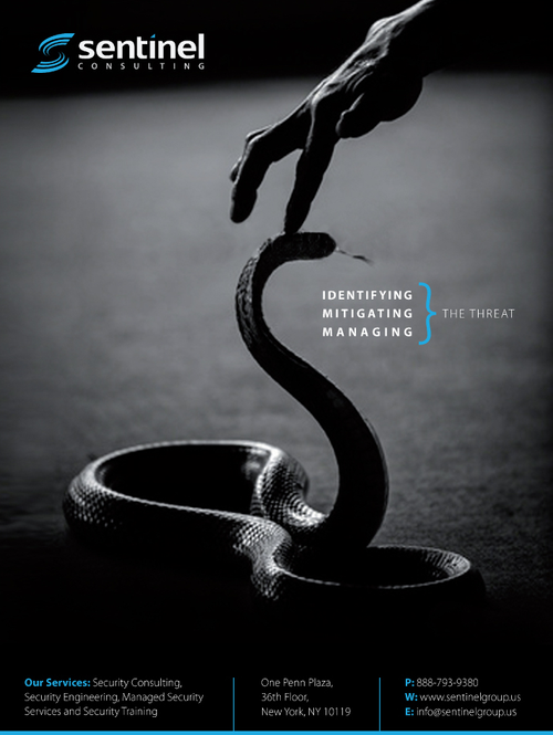
This advertisement uses contrast by making most of the photo black and white, but then added a blue logo and blue curly brace. This immediatly makes the blue stand out, drawing the viewer's eye.
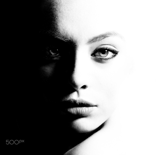
This photo uses the what we traditionally think of as contrast; black and white. However, this does not make it any less effective, as the contrast highlights the side of the face and demonstrates the different lighting styles of the photo.
Proportion
Proportion is the difference in size between two items in a design.
Proportion is usually visualized in relation to the size of
different parts of the human body. Using too large or too small
objects in a design can lead to designs that look strange or
disorient the viewer.
The golden ratio is a subset of
proportion that is achieved through a mathematical formula (approx.
the ratio 1 to 1.618). The golden ratio can help create patterns
that look believable and attractive.

This advertisement uses proportion, but mainly in the text. The words "Adopt" are in a large, bold font, immediately conveying to the viewer the main message so that if they quickly glance at it, it still communicates the desire of the author. The text beneath it is smaller but positioned closely so they eye naturally reads it after "Adopt".
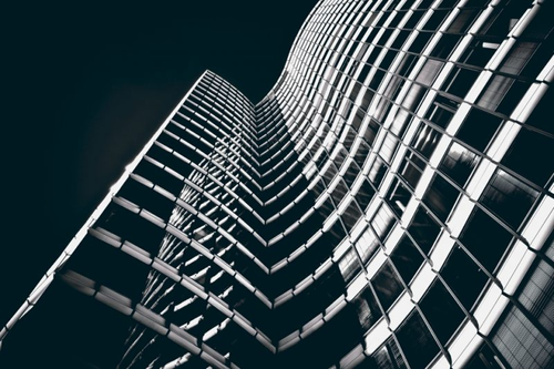
The above photo uses proportion by being taken at an angle. The building decreases as it goes towards the top of the the photo, giving the viewer an impression of perspective and making the image look 3D.
Balance
In design, balance is the placement of objects to create the desired
feel. There are three types of balance: Symmetrical Balance,
Asymmetrical balance, and Radial Balance.
Symmetrical balance is when there are equally sized and equally distributed
objects on either side of a focal point. Symmetrical balance helps to
calm and reassure the viewer.
Asymmetrical balance is intentional unbalance; when objects on either
side of a focal point are different sizes, shapes, or are in different
positions. Asymmetrical balance helps to create a feeling of chaos or
make the design feel more powerful.
Radial balance is balance that comes from equally sized and equally shaped
objects being distributed around a focal point. The difference between
radial and symmetrical balance is that radial balance allows for objects
to be mirrored all around it, rather than just across one plane. Radial
balance helps draw your eye towards the center focal point.
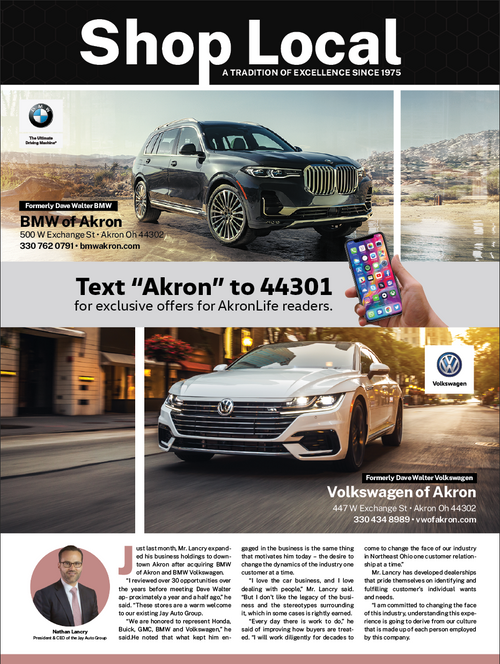
While the above photo may not look like a traditional example of Symmetircal Balance, it still exhibits it. If you were to draw a line down the middle, the cars are mirrored the same distance across it. This helps to convey a feeling of balance, where the cars are evenly showcased and equal.
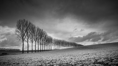
This photo showcases Asymmetrical balance. The line of trees on the left side are not balanced on the right, so the viewer looks to the left first. The trees trail off into the distance, guiding the viewer's eye and impressing a sense of distance.
Rhythm
Rhythm is the repetition of elements inside a design. Rhythm helps to create the illusion of movement objects, helping to draw attention. There are three main types of rhythm: Regular, Flowing, and Progressive. A regular rhythm is formed when the space between the elements that form it are the same. A flowing rhythm looks more organic; it can be made up of curved lines or other shapes that help give the illusion of flow. Finally, a progressive rhythm helps show a series of steps, such as an object getting bigger or moving.
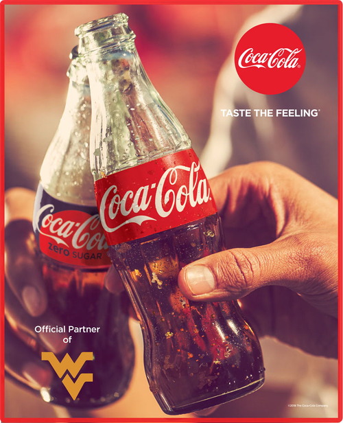
This advertisement is a great example of how rhythm can be used to showcase a corporate brand. The above advertisement repeats the logo of "Coca-Cola" multiple times and at multiple sizes; on both bottles and on the top right. This helps keep their brand memorable to a viewer who looks at this advertisement.
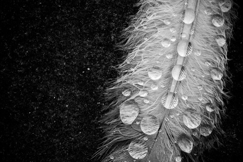
This photo is an eample of a Flowing rhythm. The water droplets on the feather are perfectly round and repeated at multiple sizes and multiple locations. This helps to make the image feel natural and organic.
Unity
Unity is the most important principle of design. Unity represents how elements interact and work together to form a design. Unity helps to hold the layout together by using similar enough elements that the viewer is not jarred away from a design. Unity can be formed with similar colors, shapes, or lines.
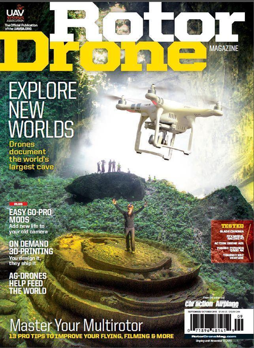
The above photo uses Unity by incorporating many other elements and principles of design to create an effective photo. For example, the drone is on a white background, giving it contrast. The proportion as it relates to the man on the ground immediatly marks it as the focal point of the image, and the environment is interesting but not special, exhibiting Negative Space and helping to keep the eye on the drone.
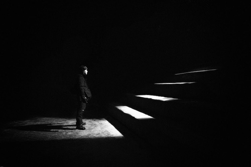
This photo exhibits Unity by using perspective and contrast on the steps. This helps the viewer recognize that the steps are one entity, in effect tying them together.
Variety
Variety is the difference between different elements of a design. While too much variety can throw off the viewer, too little can cause them to lose interest in your design. Variety can be as simple as changing an element so it is slightly different that the others. Variety can coexist with Unity by having some similar elements with some different attributes.
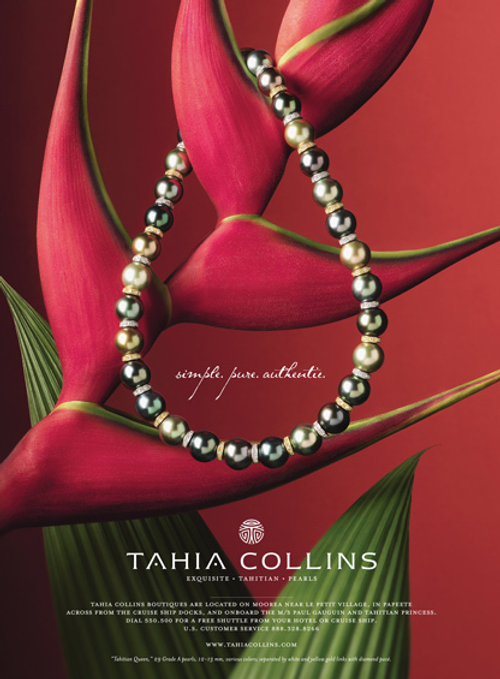
This advertisement shows Variety in the font used. Since this is a jewelry advertisement, the font reflects that by being ornate and cursive. However, the logo and details are written in an easy-to-read font to help them stand out and to make sure no one is driven away by a font they can't read.
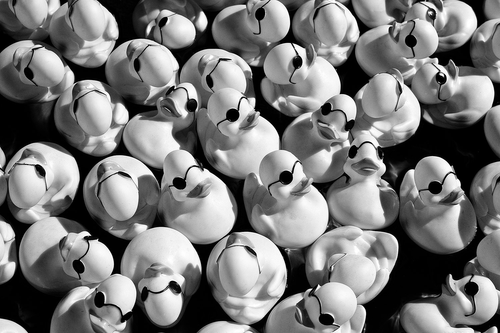
This photo is of a more traditional example of Variety. The rubber ducks are the same size and scale, but at different rotations and perspectives. This gives the design a feel of chaos or disorganization.