Elements of Design
Line
In design, lines are used to attract and guide the eye to where the
artist wants to draw attention. Lines can be straight or curved.
While lines can be thin, rectangles could also be classified as a
(rectilinear) line if they are a focal point of the design.
Lines can also create emotional responses. For example,
jagged or spiky lines gives a sense of urgency, power, and strength,
while curved lines can convey a feeling of calmness, comfort, or
gentleness. There are many different kinds of lines.

This advertisement demonstrates how properly drawn lines can help to attract attention. Notice how the white line (dotted, as if on a map) appears in the top right overlayed over a colorful photograph, helping to draw the viewer's eye. As viewers, our eyes naturally follow the line towards the X, which helps to transition into the text shown.

In this photo, lines are used by displaying a silhouette of a tree. The jagged lines of the branches help give a feeling of chaos, power, or strength, and the constrast of them on the white sky helps immediately draw the eye.
Shape
Every object is composed of shapes. A shape is like a line, but has a closed contour. They exist in 2D space, and have a height and width (but no depth, usually). There are two main types of shapes: Geometric, where the shape has sharp edges and usually evokes a feeling of being man-made, and Organic, where the shape is made up of (often not straight) lines. Shapes can be used to evoke feelings in the reader or to convey a specific meaning or intention.

This advertisement shows how shapes can be used to evoke feelings of professionalism and confidence. Geometric shapes (shapes with sharp lines) are shown, with a blue one being on the top and the other, black one, extending out from the bottom of the first. In addition, the photo of a person is inside a circle, giving the impression that he is looking out a window at the reader. In addition, the white quotation marks have smooth edges and are white, giving them the feeling that they "pop" out from the page.
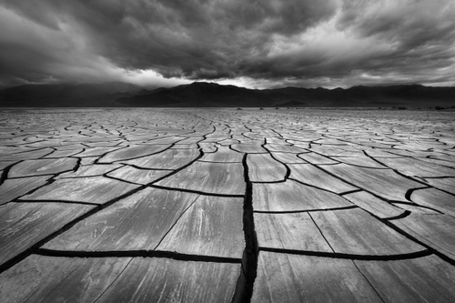
In this photo, shapes - the rocks making up the ground - are shown in 3D space. However, the shapes are still very much 2D. Organic shapes (no straight lines) are used to show how this scene is set in nature. The shapes convey feelings of perfection, as the sides of the shapes are still perfectly smooth, despite not being man-made.
Form
A form is simply a 3D version of a shape. Forms are made up of shapes, lines, and points. Similar to shapes, they can either be Geometric or Organic. Forms are used to add a look of 3D "space" to a design, and can be used to convey texture and "touch". Geometric forms are usually the ones we think of as "man-made", such as boxes, pyrimids, or perfect spheres. Geometric forms are used to evoke feelings of perfection or cleanliness, and are often used in logos and similar, man-made designs. Organic forms are more natural, and possess qualities usually not associated with man-made objects, such as surfaces that have imperfections, or ones that are not perfectly flat or smooth.
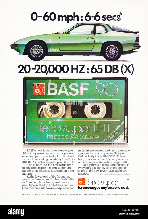
The above advertisement shows how 2D shapes can seemingly become 3D forms, with the correct application of shading. On the car, a white shading is applied over top of the green base, and is stronger on surfaces that reflect more light if the object was in real life. This makes the car seemingly "pop" off of the page and look like a 3D object, even thought it exists entirely in 2D space. In this advertisement, the car is compared to the tape-deck, and making the car and tape-deck look 3D effectively attracts attention.
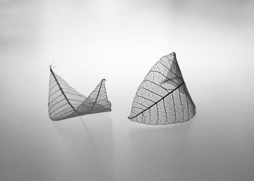
In this photo, a form is used to represent the leaves. Notice how form integrates many of the other design elements, such as lines (jagged, to evoke feelings of structure and power) and shapes, which are partially transparent to add to the feeling of depth on the leaves. Also notice the reflection off of the surface underneath, to create an even more realistic looking image.
Space
Space is classified as the area around or inside of an object. Space
is usually defined with areas of high contrast, such as black or
white (but may use other colors as well). Space is classified into
Positive Space (where an object "is") and Negative Space (where an
object "is not"). Both can be used to guide the eye to where the
designer wants it to; Positive Space by drawing attention and
Negative Space by framing the object in question.
Negative
space is usually non-descript or a solid color, because the attention
of the design should not be focused on the negative space. However, it
is just as helpful as positive space because it acts as a buffer between
the object and the outside of the image.
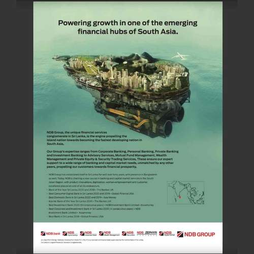
This image is similar to the corresponding photo. The island in the
image is surrounded by blue, without many defining features. This
Negative Space helps to bracket the main object and guide the
reader's eye to the island without providing distractions.
One criticism I do have with this advertisement is the fact that
the black text does not stand out from the blue background
sufficiently; this is an ineffective use of Positive space.

The above image demonstrates Space effectively because of the colors used. The contrast between the black tree (Positive space) and the white background (Negative space) immediatly draws the attention of the viewer to the tree and avoids distractions from clutter in the background of the design.
Texture
Texture is the feeling of surfaces conveyed through visual means
instead of via real touch. There are two types of Texture, Image and
Pattern, which are further divided into Environmental Image Texture,
Biological Image Texture, Man-made Image Texture, Geometric Pattern
Texture, and Organic Pattern Texture.
Image Textures are
images using to convey a real-world texture such as fur, water, or
paper. These can also be drawn, as even drawn textures can convey
the same feelings as a real-world material.
Pattern
Textures are patterns (that may not look realistic), rather than
images, that convey a feeling that corresponds to the pattern shown.
Pattern Textures are usually repeated or mirrored, and because of
this, they can be easily recalled.
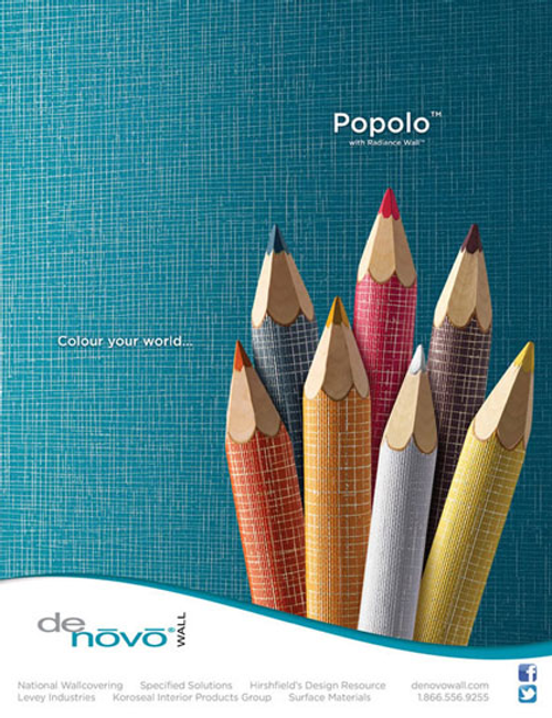
In this advertisement, the designer/author uses the real-world feel of the wood of pencils to convey the feeling that the reader is actually touching them. They use lines such as grid lines and a subtle pinpoint shading on the wooden tips of the pencil to convey these feelings.
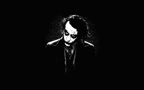
While this image could be classified as either Space or Texture, I chose Texture because it uses shading techniques such as strategically-placed black spots over the Joker's face to show wrinkles that would be there in real-life. This is an example of a Image Texture, since while this is not an actual image, Biological Image Textures include the texturing of skin.
Color
Color is one of the most important parts of design. Color is used to convey feelings; for example, blue represents authority, green represents the environment, and orange can represent hunger. Major companies use color in their logos to try and help fulfil their company goals. Public services also use color to convey their meaning quickly without much context (ex. the police use blue for authority, and because it is well-known that if they see a dark-blue car it is likely a police car).
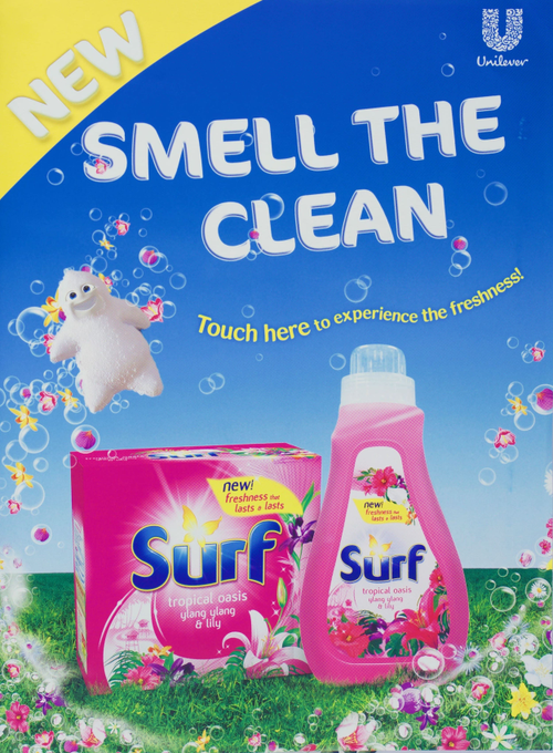
This advertisement effectively makes use of color by using pink on the box and bottle, while using green on the grass. Pink represents youthfulness and playfulness and green can represent freshness, which fits because the designers of this advertisement want you to feel clean while using this product. In addition, all of these colors are bright, which helps to evoke feelings of cheer.
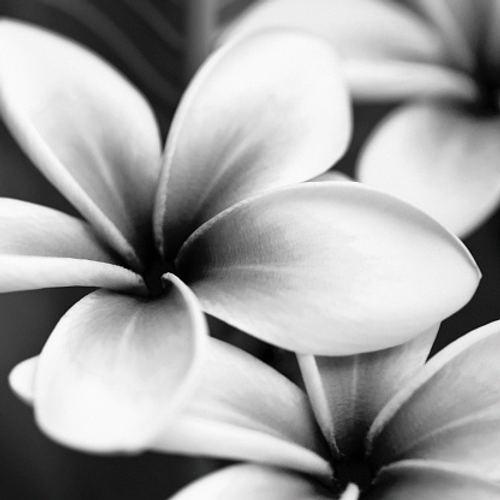
While not possessing color itself, this image effectively uses shading to show the brightness of the flower petals against their background, as well as pinprick shading to convey Texture.